
Struggling to make your appliances stand out in a sea of white and silver? Your brand gets lost. You miss sales because your products look just like everyone else's.
Custom color refrigerators are a powerful tool to solve this. By using your unique brand color, you create instant recognition, attract target customers, and make your products memorable. This simple change turns a standard appliance into a strong marketing asset, just like Coca-Cola did with their iconic red.
When I first started in this industry, I saw countless brands fighting for attention. They all tried different things, but the ones who truly succeeded understood a simple secret. It wasn't about adding complicated features or flashy designs. It was about something much more fundamental. Let's explore how you can use this same secret to your advantage.
How Can a Single Color Define Your Brand's Identity?
Does your brand have a strong visual identity? Without one, customers can't easily remember you. This lack of recognition means you are losing potential sales to more memorable competitors.
A single, consistent brand color can define your entire identity. Think about Coca-Cola's red. We've all seen it. By applying your unique brand color to your refrigerators, you make your product instantly recognizable and create a powerful, lasting impression that builds brand loyalty.
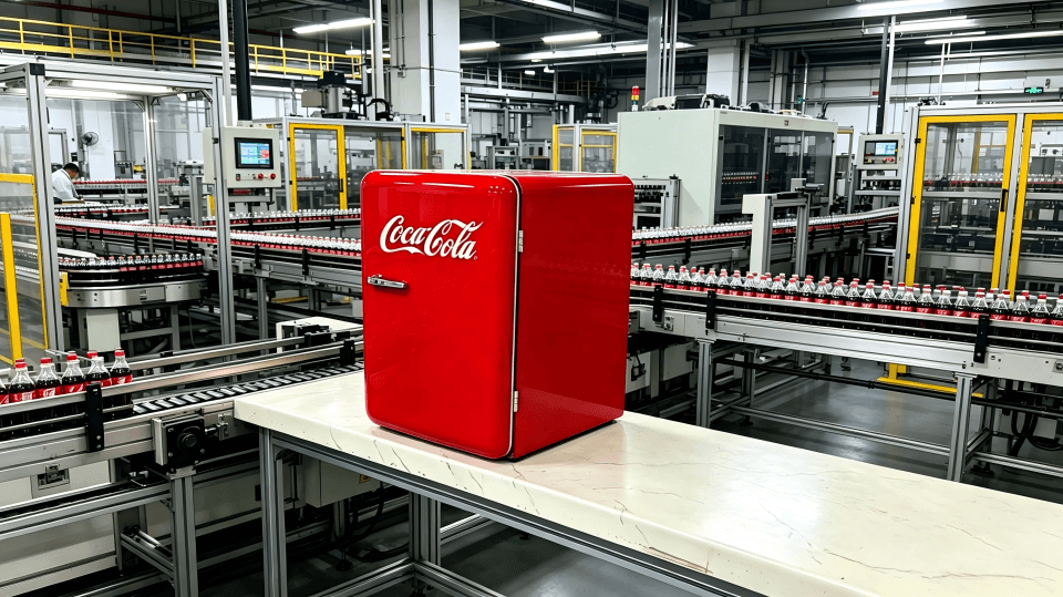
During my time running a refrigerator factory, I worked on a project that truly opened my eyes. It was for Coca-Cola. They didn't ask for fancy patterns or new technology. They wanted one thing: their specific shade of red. Every single refrigerator we produced for them was coated in that iconic color. The result? These refrigerators became more than just appliances; they became collectibles and a symbol of the brand itself.
This showed me the immense power of color identity. A brand like yours has a huge opportunity here. You don't need to overload your products with graphics. A simple, bold color choice that matches your brand can do all the work.
The Impact of a Signature Color
A signature color works tirelessly for your brand. It communicates your identity without a single word. It builds an emotional connection with your customers. When people see that color, they should instantly think of your brand.
Building Your Color Strategy
| Approach | Description | Outcome |
|---|---|---|
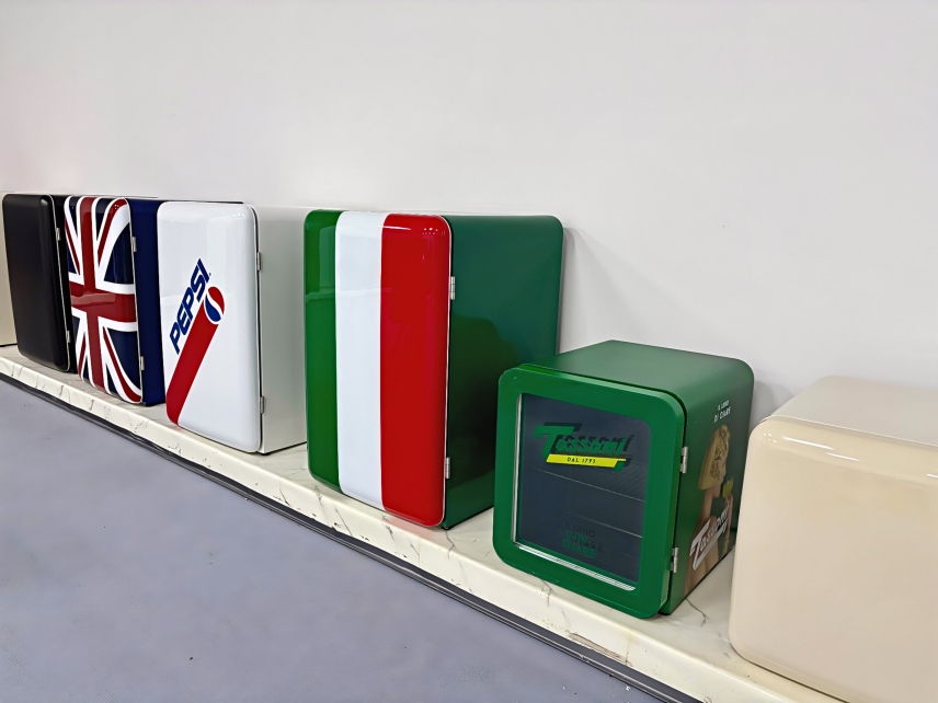
| Generic Colors | Using standard white, black, or silver. | Your product blends in with competitors. |
| Random Colors | Offering many colors without a core identity. | Can confuse customers and dilute brand message. |
| Branded Color | Consistently using one or two signature colors. | Creates strong brand recall and a premium feel. |
Choosing a color that represents your brand's personality, like you've done with your brand theme, and applying it consistently across your refrigerator line can make you the number one in your category. It is a simple yet very effective strategy.
Is a Simple Color More Effective Than a Complex Design?
Are you thinking about adding complex graphics to your refrigerators to get noticed? This can be expensive and quickly look dated. You risk confusing customers and cluttering your brand's image.
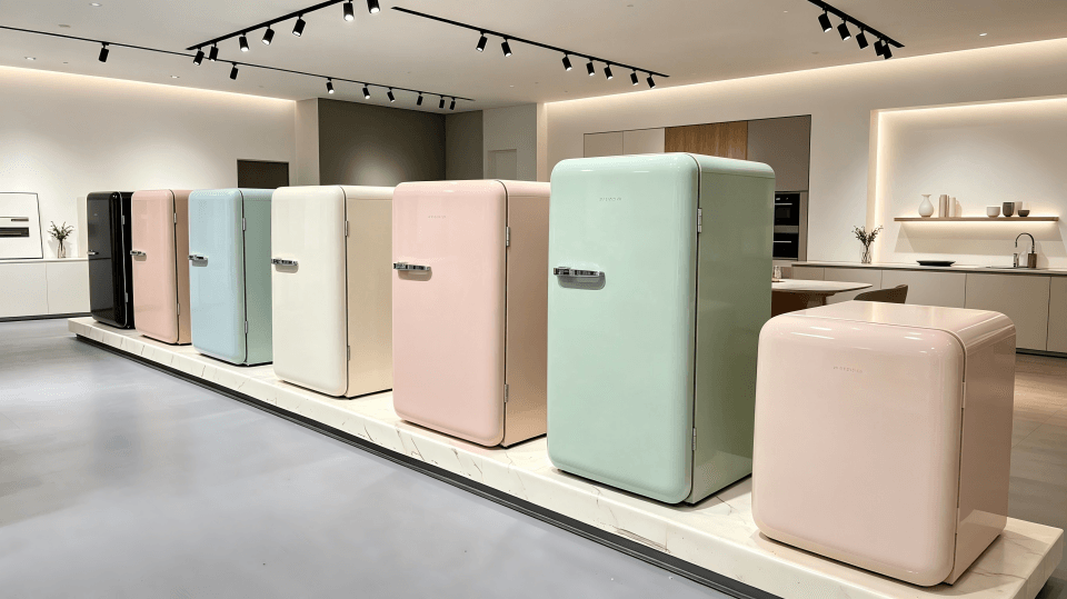
Yes, a simple, bold color is often far more effective than a busy design. A clean, single-color refrigerator looks confident and premium. It allows your brand's unique color to be the hero, creating a timeless appeal that attracts customers without the need for distracting and costly patterns.
I've seen many clients like you who believe that more is more. They want to add logos, intricate patterns, and all sorts of graphics to their products. They think this is the only way to catch a customer's eye. But I always advise them to think differently. Look at the most successful brands. They rely on simplicity.
From my experience in manufacturing, adding complex designs increases production costs and lead times. There are more steps, and the chance for errors goes up. A simple, solid color is efficient to produce. It also has a much broader appeal. A refrigerator is a long-term purchase for a home. Most people prefer a clean, elegant look that won't go out of style.
Why Simplicity Wins
Simplicity creates a look of confidence. It says that your brand is so strong, it doesn't need to shout with graphics. Your color is your statement. For your retro refrigerators, a beautiful vintage color like a pastel blue or a mint green speaks volumes more than a busy pattern would. It perfectly captures the nostalgic feeling you want to sell.
Comparing Design Approaches
| Design Element | Simplicity (Solid Color) | Complexity (Graphics/Patterns) |
|---|---|---|
| Brand Focus | Emphasizes your unique brand color. | Distracts from the core brand message. |
| Timelessness | Stays stylish for years. | Can look dated very quickly. |
| Customer Appeal | Appeals to a broader audience. | Narrows your potential customer base. |
| Production Cost | Lower and more efficient. | Higher and more complex. |
Focus on perfecting that one signature color for your retro refrigerators. Make that your trademark. It’s the most direct and powerful way to attract eyeballs and build a brand that people remember and want in their homes.
Conclusion
In short, using a unique custom color on your refrigerators is a simple, powerful way to build brand identity, attract customers, and stand out from the competition.