
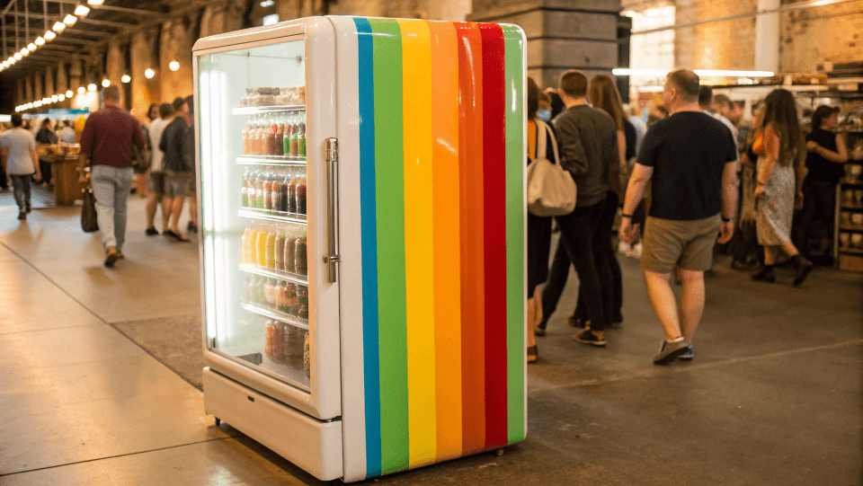
Your retail space feels generic and uninspiring. You struggle to attract customers who crave unique experiences. Vintage design can create an unforgettable, brand-defining atmosphere that boosts sales.
To transform your retail space with vintage design, focus on key eras like Mid-Century Modern or Art Deco. Use authentic materials, curated retro props, and nostalgic color palettes. This creates an immersive experience that resonates with customers and highlights your products, like retro refrigerators.
I see this all the time. Business owners know their products are great, but their showroom doesn't tell the same story. A great product in a boring space feels... less great. The good news is that creating a vintage vibe isn't about spending a fortune. It's about being smart. I learned this when I first started my own refrigerator factory. I didn't have a big budget for a fancy showroom. So, I used vintage design principles to make my small space feel special and authentic. It worked. People felt a connection. Let's break down how you can do the same.
What core elements define a vintage aesthetic for a shop?
You want a vintage look but don't know where to start. You're afraid of making it look like a cluttered antique store. Focus on key elements for a cohesive design.
A successful vintage aesthetic relies on three pillars: a specific time period, authentic or replica materials, and curated decor. Choose an era, like the 1950s diner look, then select lighting, furniture, and flooring that reflect it. This creates a clear, immersive theme for your customers.
When I helped a client in Italy who sold retro coffee machines, we started by defining his brand's era. He loved the 1960s. This single decision made everything else easier. We didn't just throw old things in his shop. We built a plan around a central theme.
Choosing Your Era
Your products can guide this choice. If you sell retro refrigerators, the 1950s or 1970s are natural fits. Your choice sets the tone for everything. It's the story you are telling your customers the moment they walk in. A cohesive story feels professional and intentional.
Key Structural Elements
Once you have your era, think about the big pieces. These are the foundations of your design.
| Element | 1950s Style | 1970s Style |
|---|---|---|
| Flooring | Checkerboard tile (black & white) | Shag carpet, terrazzo, dark wood |
| Lighting | Neon signs, globe pendants | Lava lamps, fiber optic lamps |
| Furniture | Chrome-legged stools, vinyl booths | Low-slung, modular sofas, rattan |
These foundational pieces create the backdrop for your products. It's like building the stage before the actors come on. The right stage makes the performance, and your products, truly shine.
Which color palettes and materials scream "authentic vintage"?
Your store's colors feel bland and modern. You know the right palette is crucial but are unsure what to pick. Using authentic vintage colors and materials builds instant credibility.
For an authentic vintage feel, use color palettes from specific decades. Think pastel pinks and mint greens for the 50s, or avocado green and harvest gold for the 70s. Pair these with materials like chrome, vinyl, dark wood, and textured wallpaper to create a rich, tactile experience.
When I was starting my refrigerator factory, I spent weeks studying old paint chips from car shows and antique catalogs. Color is a powerful, emotional tool. It's often the first thing a customer's brain registers. Get it right, and they feel the nostalgia instantly. Get it wrong, and the entire effect can feel off.
Color Theory by Decade
You do not need to be an artist. Just follow the historical roadmap.
- 1950s: This decade was about optimism. Think of a mix of soft pastels and bold accents. Creamy yellow, turquoise, and cherry red were very popular. This palette feels clean and happy. It's perfect for showcasing classic retro fridges.
- 1960s: Colors became bolder, influenced by pop art and social change. Bright orange, psychedelic pinks, and lime green came into fashion. It is a more daring look, but great for a high-energy space.
- 1970s: Earth tones dominated this era. Avocado green, harvest gold, burnt orange, and lots of brown. It's a warm, grounded, and slightly funky aesthetic that feels cozy.
The World of Materials
Color needs texture to feel complete. Pair your chosen palette with period-correct materials. For a 50s diner vibe, you must use polished chrome and red vinyl. For a 70s lounge, it’s dark wood paneling, velvet, and maybe even a bit of macrame. These materials feel 'real' to the touch and complete the illusion for your customer.
How can you mix retro appliances with modern retail tech?
You love the vintage vibe but need modern efficiency. POS systems and digital displays feel out of place. You can blend them seamlessly without breaking the nostalgic spell for your customers.
Integrate modern tech by hiding or disguising it. Place payment terminals in custom-built wooden enclosures. Use vintage-style TV frames for digital displays showing product info. The key is to make technology serve the aesthetic, not distract from it, ensuring a smooth customer journey.
This is a common challenge. He needs an efficient online and offline sales process. He cannot use a 1950s cash register. But a modern, plastic POS system can ruin the whole vibe. So, what's the solution? Smart disguise.
Hiding in Plain Sight
Think about how movie sets are made. The magic is in what you don't see. You can apply the same principle in your store.
- POS Systems: Build a custom countertop a bit deeper than usual. Recess the screen and card reader. Or, create a flip-top lid from reclaimed wood that covers the system when not in use. I saw a client do this with an old radio casing. It was brilliant.
- Digital Signage: Don't just hang a black TV on the wall. Frame it. You can find ornate, vintage-style frames that make a digital screen look like a piece of art. You could also project information onto a wall instead of using a screen. It's a softer, more integrated look. The ultimate goal is modern function without aesthetic friction.
How do you create an immersive vintage experience without looking dated?
You worry your vintage theme will look old, not classic. Customers might think your products are outdated too. The secret is to curate a vibrant experience, not a dusty museum.
To avoid looking dated, keep the space clean, well-lit, and uncluttered. Use vintage elements as a backdrop for your modern, high-quality products. Focus on one or two "wow" moments, like a fully restored jukebox or a feature wall, instead of filling every corner with clutter.
This is the most important part. You are not running a museum; you are running a business. The goal is to sell new, reliable, retro-styled appliances. The vintage design is a tool to help you do that, not the main attraction. The product must always be the hero of the story.
Curate, Don't Collect
A museum collects everything. A great retailer curates carefully.
- The 80/20 Rule: Let about 80% of your space be clean, simple, and functional, with excellent lighting. The other 20% is where you inject the vintage personality. This could be your flooring pattern, a feature wallpaper, or a few key pieces of statement furniture.
- Interactive Elements: Make it an experience. If you have a 1950s theme, play music from that era. Have a (working) retro coffee machine available for customers to try. I once saw a store with retro fridges that had old-fashioned magnets on them that customers could play with. It makes the space feel alive, not frozen in time.
The difference between "classic vintage" and "just old" is intention and cleanliness. A dusty, cluttered space feels old. A clean, bright, and intentionally designed space feels classic and timeless.
Conclusion
In short, using vintage design is a powerful way to build your brand. It creates an emotional connection with customers and makes your products the star of the show.